


وبلاگ
Minimal Logos in Cross-Border Trade: Why Details Are Killing Deals
A supplier submits a quotation through a digital trade portal. The buyer opens it on a phone while standing on a warehouse floor. The logo appears as a muddy smear in the email header and again as an unreadable blob in the app notification. The deal does not die because of price or lead time. It stalls because the brand never registered.
That scenario plays out daily across cross-border supply chains. Complex logos that once looked powerful on printed letterheads and exhibition banners now fail the first test of modern commerce: instant recognition on small screens and under time pressure. Simplifying a logo is not a design fashion. It is a practical response to how trade actually happens in 2026.
Operational reviews of B2B platforms and regional supply-chain networks show the same pattern. Brands that retain excessive detail lose visibility the moment their mark moves from a large format to a digital one. Those that reduce their mark to clear geometry and strong contrast maintain presence across every channel that matters—app icons, shipping documents, mobile RFQs, and social profiles used by procurement teams.
The Digital Constraint: Logos Must Survive Tiny Screens
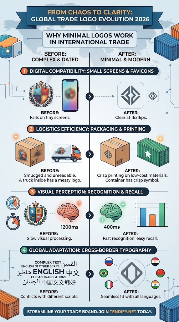
Trade no longer lives primarily on billboards or trade-show stands. A logo now appears as a 16-pixel favicon, an app icon on a phone, a profile image in a professional network, a watermark on a digital certificate, and a mark on a smartwatch notification. Each of these environments punishes detail.
Visual Rendering Stress Test
Complex Marks vs. Minimal Geometry Under Real Trade Conditions
Legacy Complex Logo
Rendered at 16×16px / 203 DPI Thermal
Failure Modes: Gradients collapse into dark smudges; thin lines disappear; brand attribution drops to zero on mobile RFQs and physical shipping labels.
Precision Minimalist Mark
Rendered at 16×16px / 203 DPI Thermal
Success Factors: High vector contrast preserves iconic geometry; fully readable on smartwatches, mobile notifications, and thermal customs manifests.
Old logos heavy with gradients, shadows, and fine line work collapse into noise at these sizes. Flat, high-contrast marks remain legible. Research on digital branding consistently shows that simplified logos retain recognition even when scaled to the smallest practical sizes required by mobile interfaces and browser tabs.
In regional analysis of Gulf and wider MENA trade corridors, procurement teams increasingly conduct initial screening on mobile devices. A logo that fails to resolve cleanly at that first glance never reaches the shortlist stage. The technical requirement is straightforward: the mark must work in monochrome, in dark mode, at extreme reduction, and across both light and dark backgrounds without relying on effects that digital rendering cannot preserve.
Speed of Recognition and the Shrinking Attention Window
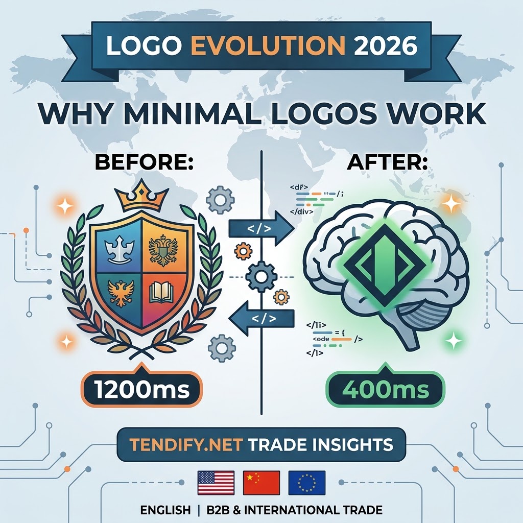
The average professional now processes thousands of visual messages daily. The window for brand recognition has compressed. Simple geometric forms and clean wordmarks are processed faster by the brain than layered, decorative designs. Studies on visual processing indicate that minimalist logos can be recognized significantly more quickly, reducing cognitive load at the exact moment a buyer or partner decides whether to engage further.
Minimal Logos in Cross-Border Trade
A practical test used in market evaluations is simple: can a non-designer reproduce the logo from memory after a single brief exposure? Marks that pass this test tend to stick. Marks that require study do not. In high-volume trade environments—where a decision-maker may scan dozens of supplier profiles in a single session—the difference compounds into measurable advantages in recall and response rates.
This is not abstract psychology. It is operational. When a freight forwarder or distributor sees the same clear mark on a container seal, a digital invoice, and a follow-up message, the association strengthens without additional marketing spend. Complexity works against that automatic reinforcement.
Industry Data and Heavy Logistics Realities
of B2B buyers conduct initial product screening & RFQ reviews via mobile devices.
Average visual processing time for simplified geometric logos vs. complex crests.
The Heavy Industrial Shift (Volvo & Scania): Look at the strategic rebrands of industrial manufacturing giants like Volvo Group و Scania. Both transitioned from 3D chrome emblems with heavy metallic shading to flat, 2D vector marks. This was not a consumer-facing aesthetic choice—it was driven by digital telematics, fleet management mobile apps, and low-power IoT displays inside truck cabs where 3D gradients fail to render legibly.
Logistics Scale (Maersk & DHL): A Maersk container star or DHL wordmark must be instantly recognizable whether scaled to a 40-foot shipping container, rendered as a 16px favicon on a tracking portal, or printed on a thermal manifest. In global trade, instant visual recognition reduces cognitive fatigue for procurement managers evaluating dozens of competitive bids in a single screen session.
Versatility Across Physical and Digital Production
A logo in international trade must travel. It appears on product packaging, metal nameplates, embroidered uniforms, laser-etched components, animated video openers, and single-color printing for customs documents. Every additional detail raises production cost and failure risk.
Customs, Compliance Labeling, and Thermal Printing Realities
In cross-border trade, a logo extends far beyond digital storefronts and marketing decks—it must physically endure primary product packaging, master cartons, and standardized customs compliance labels (including GS1 standards, barcodes, QR codes, and EU/MENA export regulatory markings).
A critical, often-overlooked failure point occurs at warehouse processing centers and port authorities. Standard industrial thermal label printers operate at a low resolution of 203 DPI. When complex, multi-layered logos with fine gradients or thin lines are rendered under these conditions, they print as unreadable, smudged black blobs. This thermal distortion can obscure adjacent machine-readable compliance codes, leading to scan errors, automated sorting failures, and costly clearance delays during physical customs inspections.
Flat, single-color-capable designs reduce those frictions. They print cleanly on low-cost substrates, engrave without loss of detail, and animate without visual conflict. Experiences from supply-chain operations show that companies still using multi-layer logos incur higher artwork preparation costs and more frequent reproduction errors when materials move between printers, fabricators, and digital platforms.
The economic case is direct. A mark that requires specialized color management or high-resolution output for every application becomes a recurring expense. A reduced mark becomes a fixed asset that works across the entire chain.
Cross-Border Typography and Multilingual Adaptation
Cross-border trade across diverse hubs—such as the GCC, Europe, China, and Turkey—demands seamless adaptation across distinct script systems (Arabic, Latin, Hanzi, and Cyrillic). Complex, decorative logos with script-bound ornaments often create severe visual disharmony when paired with localized business documentation, official customs manifests, or dual-language packaging.
Minimizing logo geometry and adopting clean, high-legibility wordmarks eliminates typographic conflict. A streamlined mark establishes a neutral, highly adaptable structural anchor. This enables international trade brands to pair their primary identity effortlessly with regional scripts—such as Arabic/Persian typography or Chinese characters—on shipping labels, invoices, and B2B portal profiles without sacrificing visual hierarchy or brand integrity.
The Shift from Skeuomorphism to Functional Clarity
Earlier digital interfaces tried to mimic physical objects—leather textures, glass reflections, beveled edges. Users no longer need those visual metaphors. Interfaces have matured, and so have expectations of brand marks. The move to flat design removed decorative layers that once signaled “premium” but now signal “dated.”
Automotive, technology, and consumer brands that once relied on three-dimensional effects have systematically flattened their marks. The same logic applies to B2B identities. A logo that still carries the visual language of the mid-2000s reads as out of step with the digital trade tools buyers now use daily.
The Real Risk: Blanding and Loss of Distinction
Simplification has a clear downside. When every brand reduces to the same geometric sans-serif and the same limited palette, distinctiveness evaporates. This phenomenon, often called blanding, has been especially visible among luxury and technology names that converged on nearly identical wordmarks.
In competitive trade markets the cost is higher. A supplier whose mark is interchangeable with three competitors loses the ability to own a visual position in the buyer’s mind. Recognition without attribution is useless. Market observations show that brands which strip away every distinctive element in pursuit of “clean” often experience a measurable drop in correct brand attribution even as recognition of the generic shape remains high.
Intellectual Property and International Trademark Registration
Beyond visual aesthetics, geometric simplification directly streamlines international intellectual property (IP) protection. When registering trademarks across multiple jurisdictions via the WIPO Madrid System, complex marks with intricate shading, overlapping gradients, or hyper-detailed graphics face higher friction during formal examination and visual search clearance.
Clear, vector-based geometric marks are significantly easier to classify under Vienna Classification codes (WIPO’s international system for figurative elements). This clarity accelerates trademark clearance searches, reduces registration disputes in national IP offices, and enables border control authorities to rapidly cross-reference genuine goods against counterfeit infringements during customs inspections.
The solution is not a return to decorative complexity. It is precision minimalism: retain one or two highly distinctive elements—proportion, a unique terminal on a letterform, a carefully calibrated negative space, or a single non-generic geometric relationship—while removing everything else. The goal is a mark that is simple enough to scale and specific enough to own.
Practical Steps for Trade Companies
Audit the current mark against real usage conditions:
- Reduce it to 16 × 16 pixels. Does the core idea survive?
- Convert it to pure black and pure white. Does it still read?
- Place it on both light and dark digital backgrounds and on typical shipping-document paper stock.
- Test recognition with people outside the company who have seen the mark only once.
If the mark fails any of these tests, the redesign priority is clear. Start by identifying the single strongest visual idea already present. Protect that idea. Remove secondary layers, gradients, and thin lines that disappear under reduction. Ensure the resulting mark works as both a standalone symbol and a wordmark when required.
For companies building presence on digital trade platforms, the logo becomes part of a larger system of trust signals. Consistent, legible marks across profile pages, document headers, and message interfaces reduce friction in first contact. Tools that support professional digital presence—including those available through the broader Tendify ecosystem—benefit when the visual identity itself is already optimized for the environments in which those tools operate.
Internal Resources for Further Reading
Teams reviewing their digital footprint may also find value in related guidance on building efficient B2B systems and professional networks:
- Digital tools every import and export business needs to scale globally
- Essential B2B software tools to improve efficiency and revenue
- The power of proximity: how to build a professional ecosystem that scales your business
خلاصه اجرایی
Operational Comparison: Legacy vs. Minimalist Brand Marks
| Operational Dimension | Legacy / Complex Logos | Precision Minimalist Marks |
|---|---|---|
| 203 DPI Thermal Printing (Customs Labels) | Gradients and fine lines blur into unreadable smudges; risks obscuring adjacent compliance barcodes. | High vector contrast ensures clean monochrome output on shipping manifests and master cartons. |
| Mobile & Small Screens (RFQs, Favicons) | Collapses into visual noise at 16×16px; loses brand attribution during fast mobile screening. | Retains instant geometry recognition across smartwatch notifications and mobile trade portals. |
| Multi-Script Adaptation (GCC, EU, China) | Decorative elements clash with localized typography (Arabic, Hanzi) on dual-language invoices. | Acts as a neutral anchor, pairing seamlessly with diverse regional scripts without layout friction. |
| Cognitive Recall & Processing Speed | Requires higher mental effort to process (~1200ms); harder for buyers to memorize. | Fast visual processing (~400ms); easy to recall across high-volume procurement sessions. |
Frequently Asked Questions
Key Operational Takeaways
Why are B2B and trade companies simplifying their logos in 2026?
B2B brands are simplifying logos to maintain visual legibility across mobile trade portals, app icons, smartwatch notifications, and low-resolution (203 DPI) industrial thermal printers used for customs shipping labels.
How does logo design affect physical customs clearance and shipping?
Complex logos with gradients and fine lines blur when printed on standard warehouse thermal printers. This distortion can bleed into adjacent machine-readable barcodes or QR codes, causing automated scanner errors and clearance delays at port authorities.
What is “blanding” and how can trade brands avoid it during redesigns?
“Blanding” occurs when simplification strips away all unique elements, making a brand indistinguishable from competitors. Brands can avoid this by practicing precision minimalism—retaining one or two highly distinctive geometric elements while eliminating unnecessary clutter.
How does a simplified logo assist in cross-border typography and dual-language documentation?
Streamlined, flat logos act as neutral visual anchors. They seamlessly pair with localized regional scripts (such as Arabic, Chinese, or Cyrillic) on dual-language invoices and customs manifests without causing layout friction.
Closing the Gap Between Identity and Reality
A logo is no longer a static emblem designed primarily for print. It is a functional component of every digital and physical interaction a company has with partners, buyers, and logistics providers. Simplification is the response to that reality. Done correctly, it increases recognition speed, reduces production friction, and protects the brand under the conditions that actually govern cross-border trade.
Done carelessly, it produces a mark that is legible but forgettable. The difference lies in whether the reduction serves a clear idea or simply follows a visual trend.
Companies that treat their visual identity as an operational asset rather than a decorative afterthought gain a measurable edge in the first seconds of every digital encounter. In markets where attention is scarce and first impressions form on small screens, that edge is decisive.
To move faster from visual identity to operational execution—secure documentation, reliable counterparties, and streamlined cross-border processes—register and begin building your presence at https://tendify.net/my-account/. The platform exists to reduce the friction that still slows most international trade relationships.

